Item Details
If you want to display more info about selected items in your inventory, you can use the InventoryDetails component. It will let you display an item’s information, while browsing your inventory. It can automatically hide itself when no item is selected.
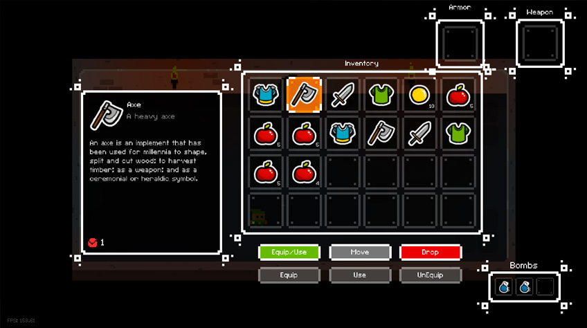
To create a details panel, all you need is to create a new Image object inside a canvas, and add a CanvasGroup and an InventoryDetails component to it. You’ll need to specify the name of your target inventory, default texts and icon, and bind a few sub components to it : an icon, and title, long and short description and quantity placeholders
Counter Display
Sometimes you may want to display a simple counter somewhere in your UI, outside of dedicated inventory panels. The InventoryCounterDisplay component is there for that! Add that component wherever you prefer, and in its inspector, bind a target Text component to update with a quantity. You can then define a list of items to count, as well as a number of inventories in which to count these items in. The total will be displayed in the specified format on your TargetText. That’s an easy way to display your current amount of coins, for example, and you’ll be able to see an example of just that in action in the PixelRogueRoom1 and 2 demo scenes.